Borrowing Taste: Using GitHub Design Skills to Cut the AI Slop
AUGUST 24, 2026 · Design
I've noticed people online sharing GitHub repos aimed at stripping "AI slop" out of design work, so I decided to try a few on my own frontend. I don't have a strong design or UX background, and it shows in the kind of interfaces I tend to ship by default: generic spacing, motion that's either absent or overdone, cards that all look the same. Three repos stood out enough to actually use: design-motion-principles, awesome-claude-design, and taste-skill.
What changed on the portfolio
I ran these against this site first. The clearest wins were in the cards and the motion: tags became rounded pill badges instead of plain text, card shadows got lighter and less heavy-handed, and the rounded corners on project headers finally matched the rounded corners on the cards below them instead of quietly clashing. Content now fades into view a little more gently as you scroll, instead of snapping in fast enough to feel rushed. The palette and typography didn't move. Same site, just sharper.
Running it on the matchup chatbot
I then pointed the same skills at the frontend for Matchup Copilot, the chat interface for my League of Legends matchup app. The best catch was a glow effect that kept pulsing the whole time the AI's answer was streaming in, even after the words themselves were already visible. I replaced it with a simple typing indicator that only shows for the brief moment before the AI starts responding, then disappears the instant real text shows up. Messages now pop into the chat noticeably faster, and the send button finally gives a little visual press when you click it, something it never did before.
Before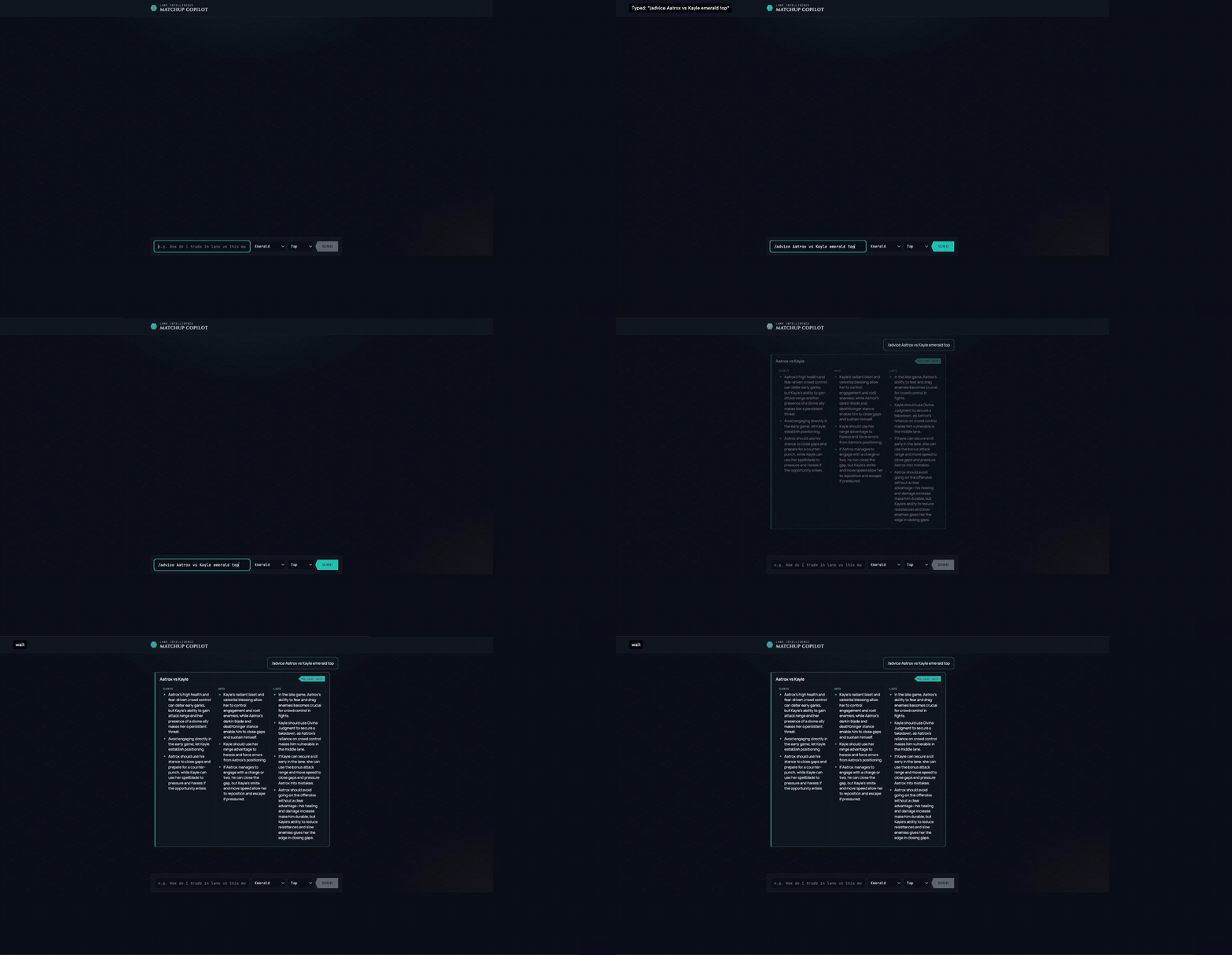
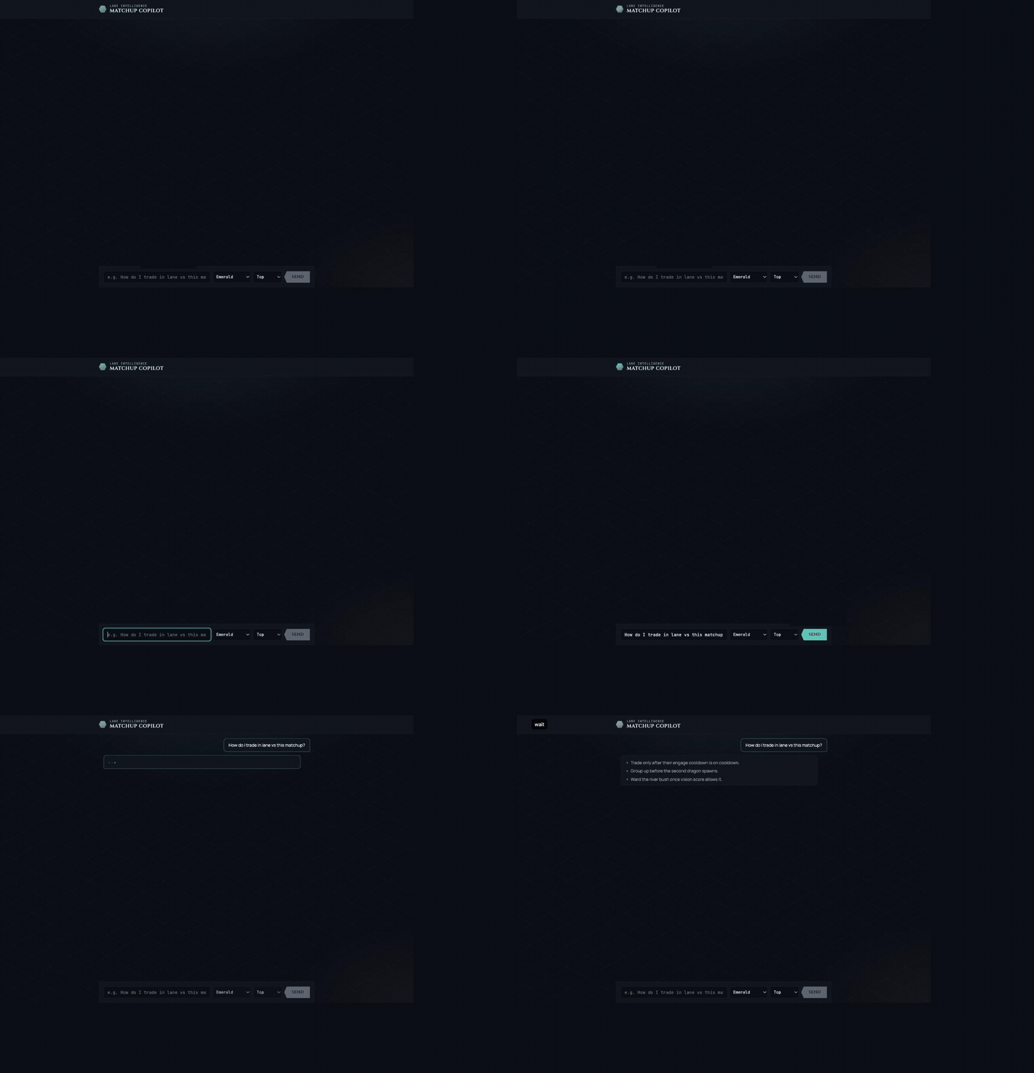
What I'd change next time
Both times I applied these skills after the interface already existed, once things were already built. Next build, I want to bring them in during planning instead, before I've committed to a layout, and see how much that actually changes things versus fixing it after the fact.